🔒 NDA
This case study has been adapted to honor confidentiality agreements. Certain details have been altered or omitted to protect proprietary information, while accurately reflecting my role and design approach as a Senior UX Designer.
Point of Sale , B2B
Designing a Savings flow experience to Reduce Churn for At-Risk Customers
I helped to create a Save flow experience that helps customers at risk of churn discover cost-saving opportunities and feel more valued — ultimately driving retention.
Role
Senior UX Designer
Team
Product manager
CX partners, Developers
Timeline
3 Weeks
Tools
Figma, Jira
Domain
Telecom
Platform
iPad mini
The problem
what’s the problem?
This client was seeing a rise in customer churn, particularly among price-sensitive users. Internal data showed that many users:
• Didn’t know they were eligible for plan downgrades or promotions
• Were unaware of unused perks or duplicated subscriptions
• Felt their monthly bills were rising without explanation
“It feels like I’m overpaying for things I don’t even use.”
-Customer
BUSINESS Goals
Reduce churn among high-risk segments by offering personalized, self-service value optimization.
Lower call center costs by reducing support calls about billing confusion.
Improve retention metrics by surfacing upgrade/downgrade options in-product.
Drive upsell opportunities via more visible perk configurations and smart recommendations.
User Goals
Understand what they’re paying for in a clear, non-technical way.
Identify ways to save without needing to call customer support
Feel empowered to optimize their plan/perks without losing value.
Gain trust that Verizon is looking out for their usage and needs.
discovery
Analysing the current experience
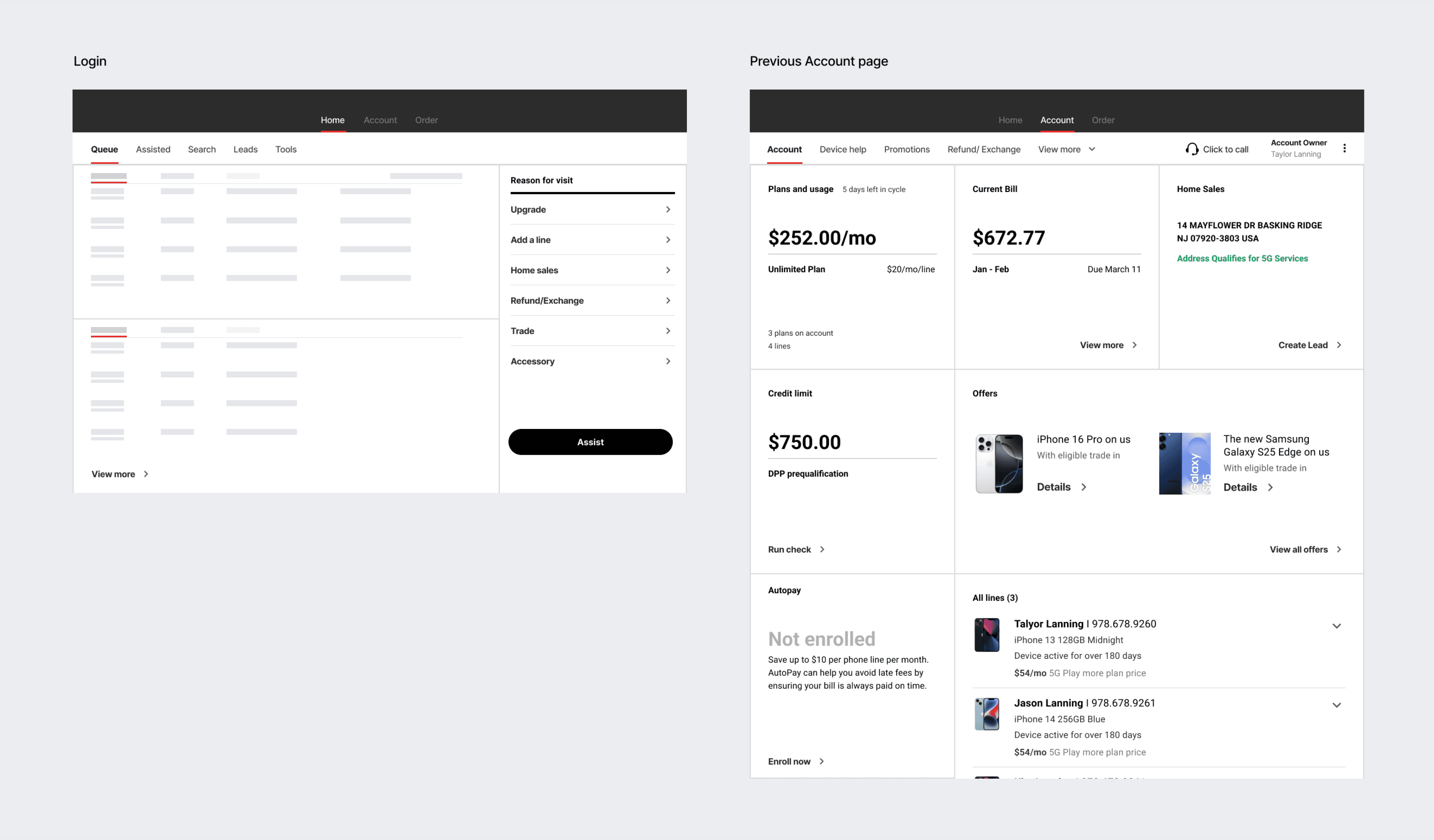
Current POS flow

Current Flow in POS
discovery
Who I was designing for?
Taylor Lanning , Customer

Age : 54 Years
Account Owner
Tenure : 4 years
Household : 2 members
Tech comfort - Low
Needs:
She wants explanation of the Bill increase from her previous bill.
Make sure she’s not paying for things she doesn’t use
Behaviour:
She wants to go to store to get explanation
for her bill in her own convenience
Mindset:
In the month of March, when her bill was generated she found that her bill was higher than previous month and she is not able to figure out the reason for higher bill. Doesn’t want to call support and wait — prefers to self-serve
Pain points:
Doesn’t recall subscribing to certain add ons but sees a charge.
Not able to find the reason for her bill increase from her Bill statement.
“I’m not against paying more — I just want to know why it went up this month. Was it a fee? A perk? Did someone add something?”
Roy Martinez , In-Store Representative

Age : 34 Years
Primary device : iPad (POS system) + desktop portal at store
Tech confidence - High
Needs:
Faster ways to resolve queries without switching apps.
Quickly understand customer bill breakdowns without jumping through multiple tools
Retain customers by suggesting value-based solutions
Behaviour:
Often juggles multiple customers at once, especially during peak hours.
Prefers quick scripts, visual explanations, and side-by-side comparisons.
Motivation:
Wants to build rapport and retain customers. Sees himself as the customer's advocate inside the system and feels proud when customer leaves the store fulfilled.
Pain points:
Hard to explain bill changes clearly without customer feeling misled.
Billing related information is fragmented. He needs to toggle between 2–3 screens
““I can’t control pricing, but I can control how well I explain it.””
ideate
Generating ideas
Once we understood the root issues around billing confusion — especially from users like Taylor — we moved into a focused ideation phase.
Goal:
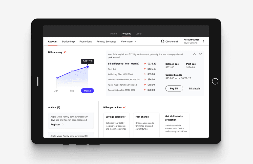
Design a contextual “Bill Insights” section that dynamically appears on the customer account page when the system detects billing confusion (like a sudden increase or a user selecting “Bill Help” in the menu/chat). The insights will be curated by AI model leveraging the bits of information of user across different omni channel touch points - Digital, or calling the call centre and also taking into account the pattern of similar profiles with billing issues and suggesting best recommendations.
Point of Sale , B2B
Designing a Savings flow experience to Reduce Churn for At-Risk Verizon Customers
I helped to create a Save flow experience that helps customers at risk of churn discover cost-saving opportunities and feel more valued — ultimately driving retention.
🔒 NDA
This case study has been adapted to honor confidentiality agreements. Certain details have been altered or omitted to protect proprietary information, while accurately reflecting my role and design approach as a Senior UX Designer.
Role
Senior UX Designer
Team
Product manager
CX partners, Developers
Timeline
3 Weeks
Tools
Figma, Jira
Domain
Telecom
Platform
iPad mini
The problem
what’s the problem?
Verizon was seeing a rise in customer churn, particularly among price-sensitive users. Internal data showed that many users:
• Didn’t know they were eligible for plan downgrades or promotions
• Were unaware of unused perks or duplicated subscriptions
• Felt their monthly bills were rising without explanation
“It feels like I’m overpaying for things I don’t even use.”
-Customer
BUSINESS Goals
Reduce churn among high-risk segments by offering personalized, self-service value optimization.
Lower call center costs by reducing support calls about billing confusion.
Improve retention metrics by surfacing upgrade/downgrade options in-product.
Drive upsell opportunities via more visible perk configurations and smart recommendations
User Goals
Understand what they’re paying for in a clear, non-technical way.
Identify ways to save without needing to call customer support.
Feel empowered to optimize their plan/perks without losing value.
Gain trust that Verizon is looking out for their usage and needs.
discovery
Analysing the current experience
Verizon was seeing a rise in customer churn, particularly among price-sensitive users. Internal data showed that many users:
Didn’t know they were eligible for plan downgrades or promotions
Were unaware of unused perks or duplicated subscriptions
Felt their monthly bills were rising without explanation
Current Flow in POS
discovery
Who I was designing for?
ideate
Generating ideas
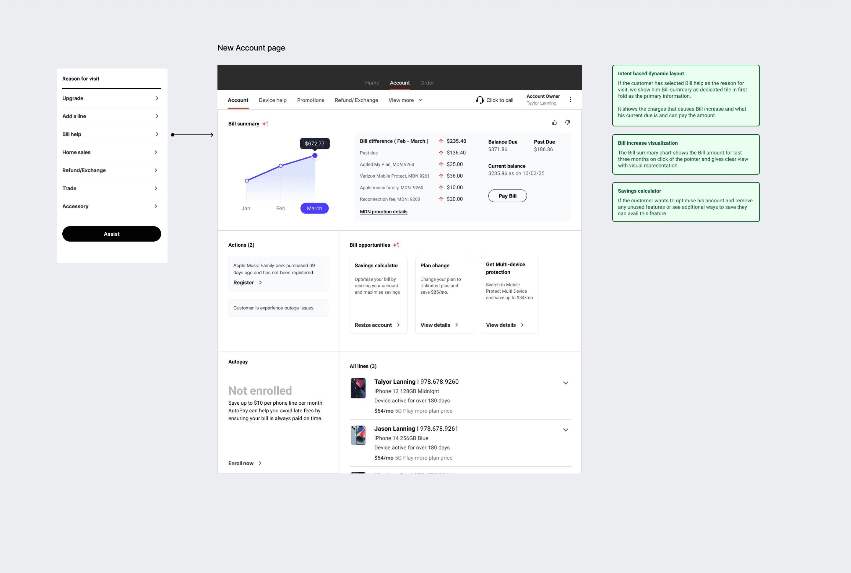
Once we understood the root issues around billing confusion — especially from users like Taylor — we moved into a focused ideation phase.
Goal:
Design a contextual “Bill Insights” section that dynamically appears on the customer account page when the system detects billing confusion (like a sudden increase or a user selecting “Bill Help” in the menu/chat). The insights will be curated by AI model leveraging the bits of information of user across different omni channel touch points - Digital, or calling the call centre and also taking into account the pattern of similar profiles with billing issues and suggesting
best recommendations.
Taylor Lanning , Customer
Age : 54 Years
Account Owner
Tenure : 4 years
Household : 2 members
Tech comfort - Low
“I’m not against paying more — I just want to know why it went up this month. Was it a fee? A perk? Did someone add something?”
Roy Martinez ,
In-Store Representative
Age : 54 Years
Account Owner
Tenure : 4 years
Household : 2 members
Tech comfort - Low
I can’t control pricing, but I can control how well I explain it.”
ideate
Generating ideas
Generating ideas
Once we understood the root issues around billing confusion — especially from users like Taylor — we moved into a focused ideation phase.
Goal:
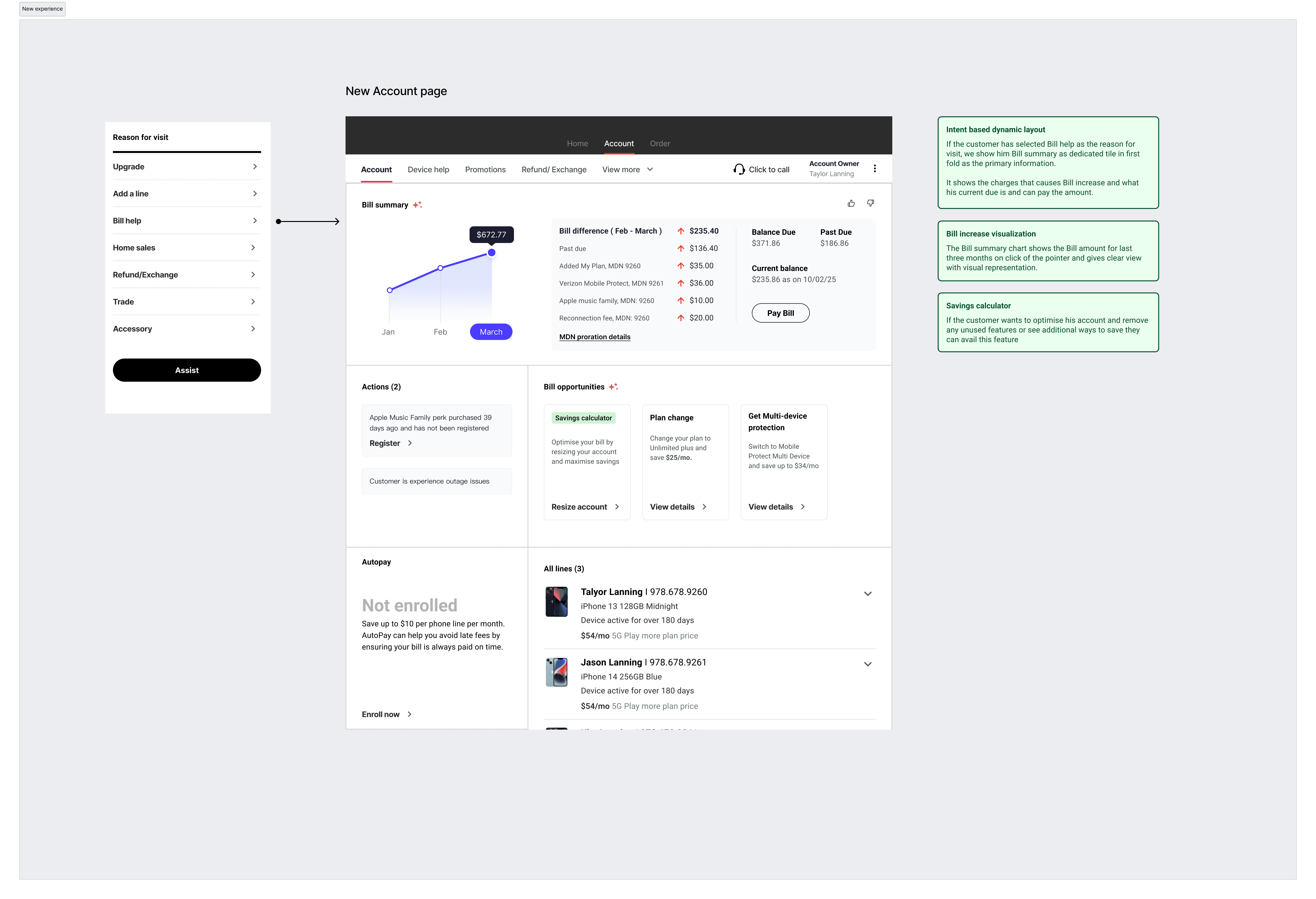
Design a contextual “Bill Insights” section that dynamically appears on the customer account page when the system detects billing confusion (like a sudden increase or a user selecting “Bill Help” in the menu/chat).
The insights will be curated by AI model leveraging the bits of information of user across different omni channel touch points - Digital, or calling the call centre and also taking into account the pattern of similar profiles with billing issues and suggesting best recommendations.
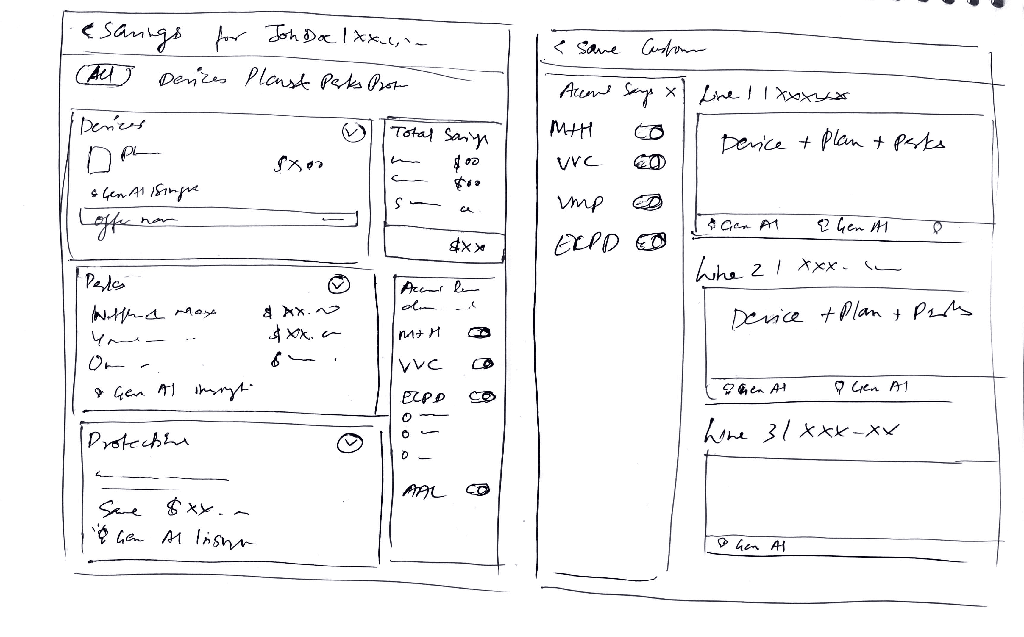
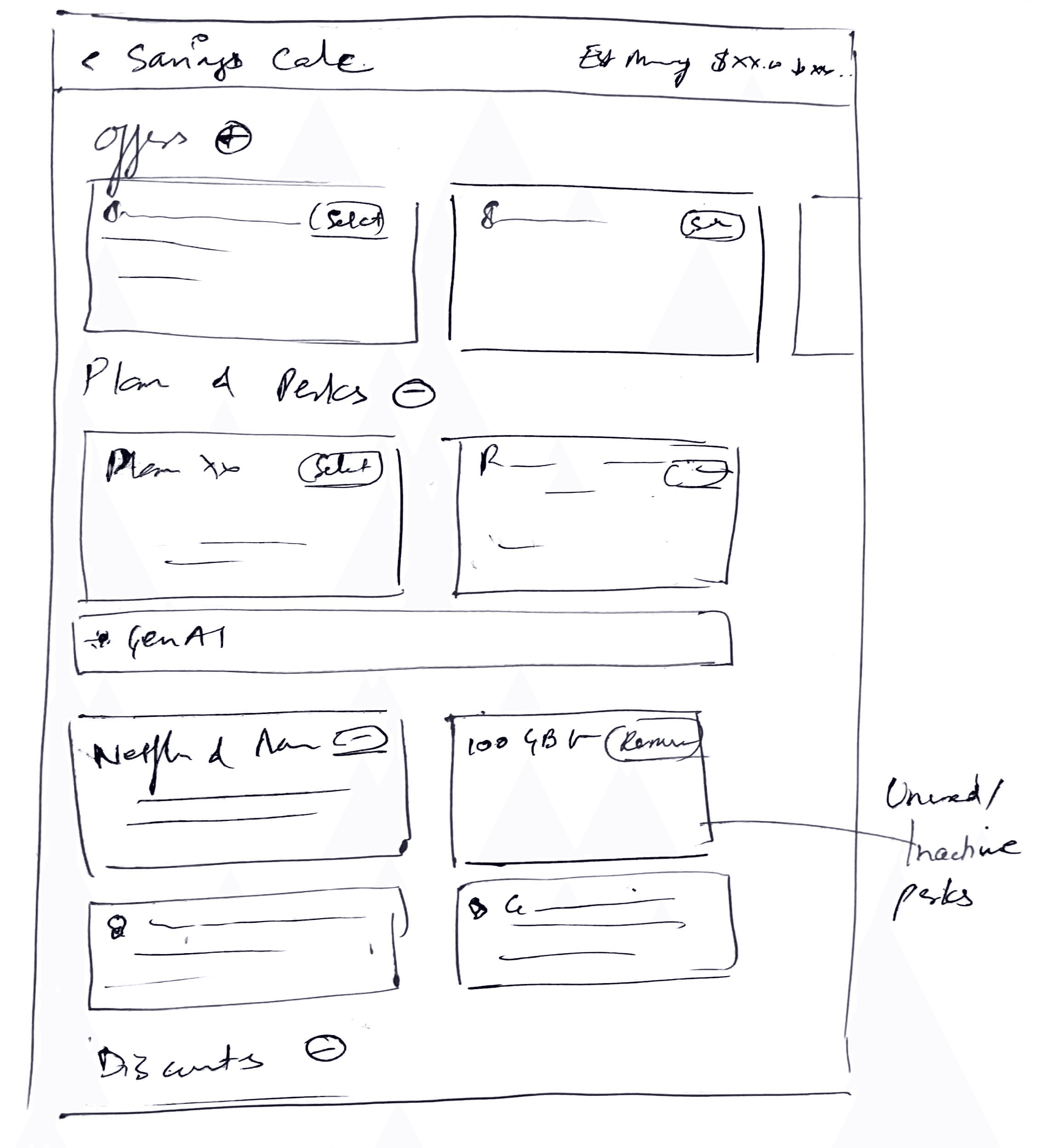
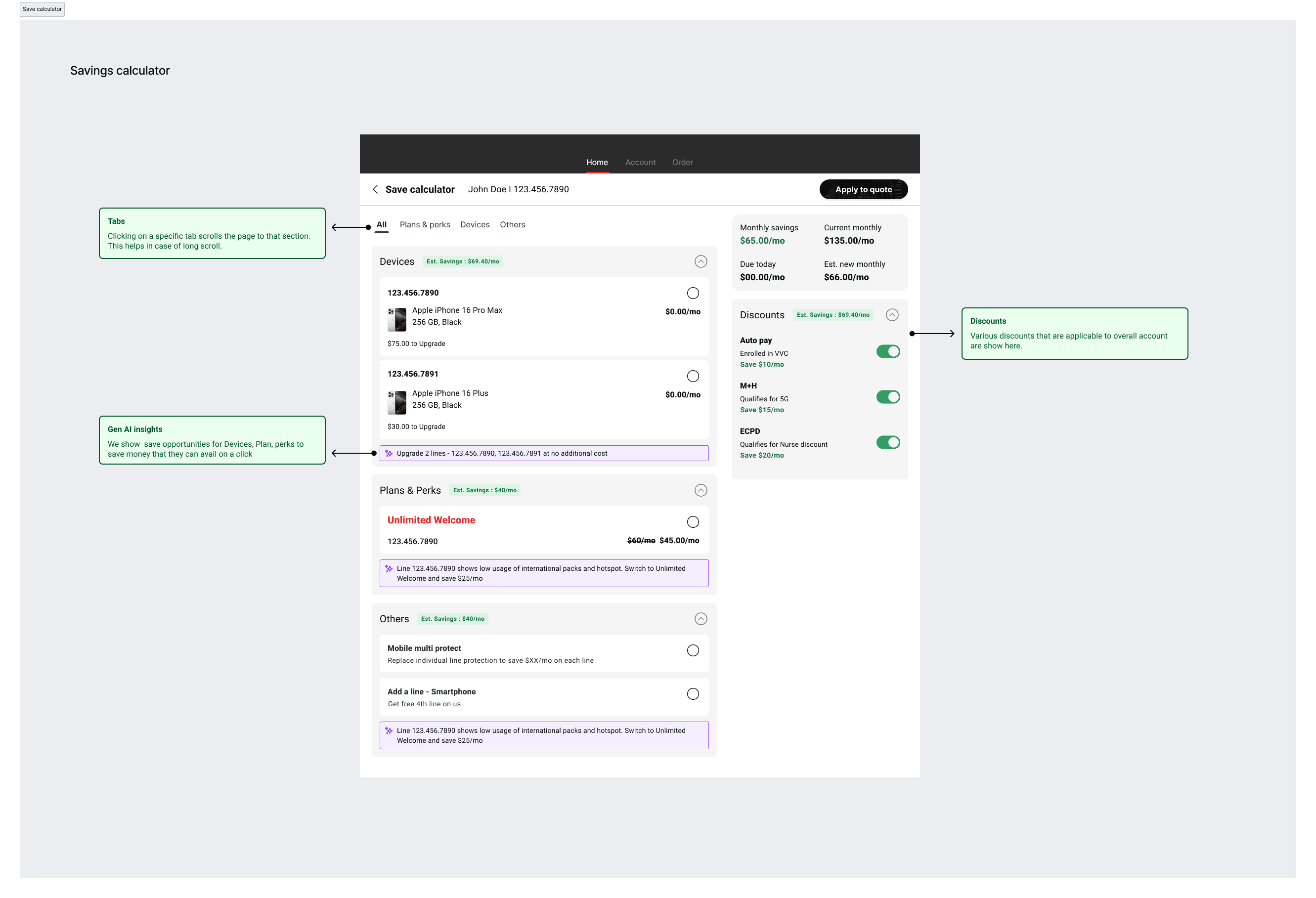
Savings calculator
I also worked on concept for Saving calculator which was a tool for enabling rep to find opportunities to add more savings to the overall account and gives account overview.