
B2C
Redesigning a complex custom-blinds journey to help customers confidently configure, price and purchase their blinds.
Role
Senior UX Designer
Team
Product manager
CX partners, Developers
Timeline
1 week , '25
Tools
Figma, Jira
Domain
Ecommerce
Platform
Desktop, mobile
BACKGROUND
Blinds Direct sells made-to-measure blinds, which means customers need to make several decisions before they can purchase — including measurements, fitting type, colour and product configuration.
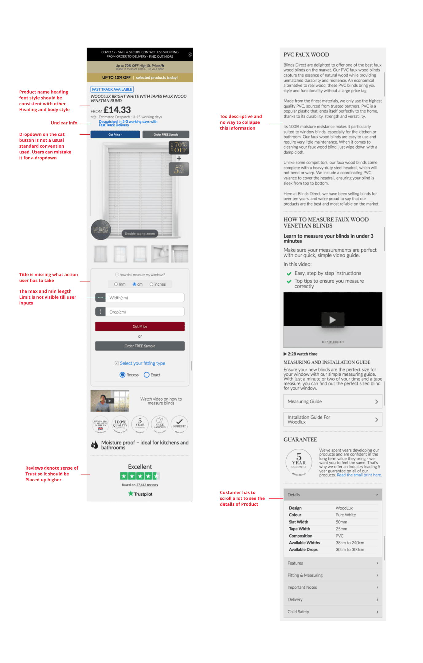
The existing product page attempted to surface much of this information in a single experience. The initial evaluation showed that important product information was competing with configuration, measurement guidance, reviews and supporting content.
It resulted in a page that required customers to scroll and search for contextual information while simultaneously trying to configure their product.
ANALYSIS
The problem wasn't a lack of information.
It was how the information competed for attention.
01 — Information overload
Important product information competed with supporting content.
02 — Measurement was critical
Customers needed to enter dimensions to understand their price.
03 — Configuration was complex
Customers had to make several decisions before completing the purchase.
04 — Context was fragmented
Supporting information wasn't always available at the moment the customer needed it.
The original evaluation specifically identified overwhelming/unnecessary information and the need to curate the layout and content around the user's goal.
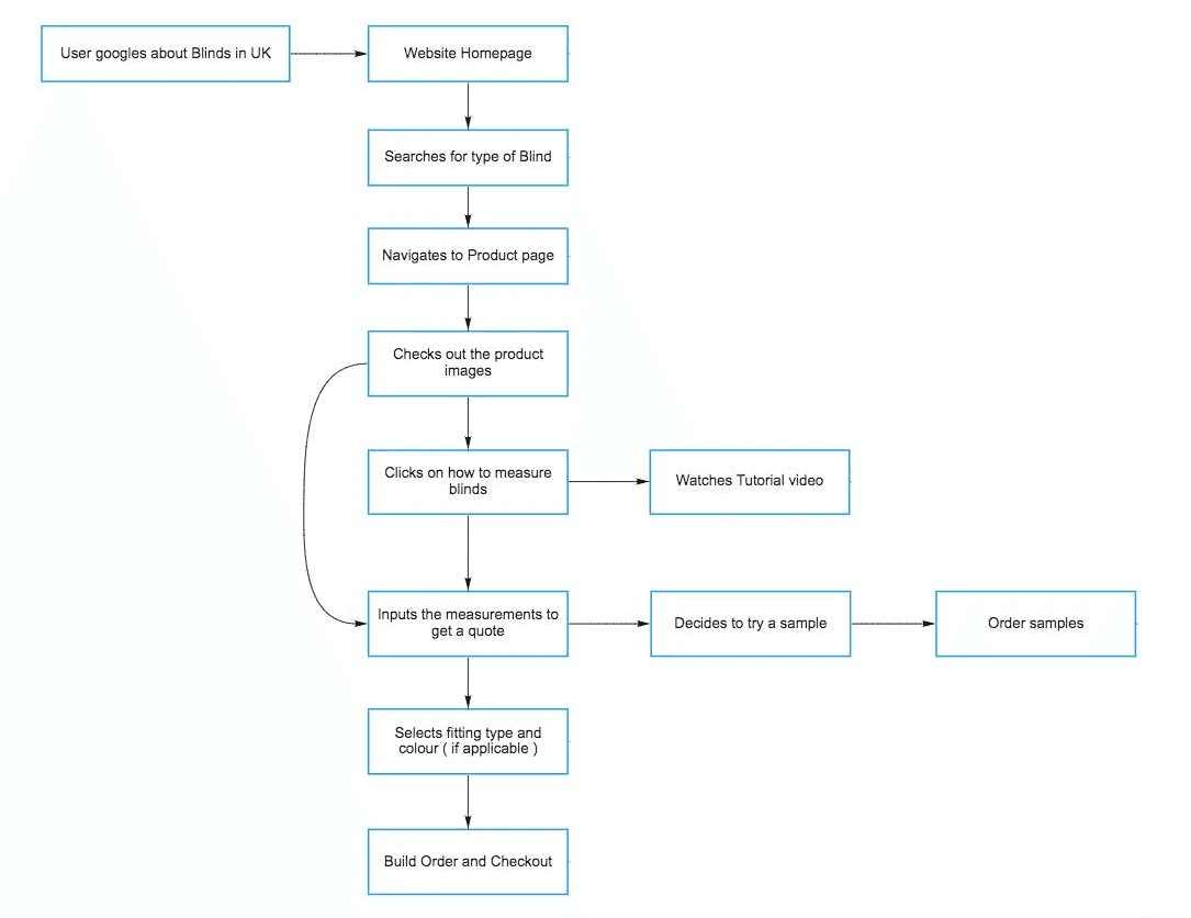
JOURNEY
Current PDP
DESIGN STRATEGY
Shift the experience from information density to guided decision-making.
1. Guide and not overwhelm
Prioritise the information needed for the decision happening now.
2. Poor Emotional Engagement
The interface solved functional needs but lacked delight..
3. Adult-Oriented Patterns
Many interactions felt adapted from traditional smartwatch experiences rather than designed specifically for children.
4. Parent Context Gap
Parents received raw information rather than actionable insights.
5. Low Everyday Engagement
Outside of communication and safety moments, the watch offered limited reasons for children to engage regularly, reducing long-term stickiness and retention.
6. One-Size-Fits-All Experience
The experience did not evolve based on a child's age, maturity, routines, or changing family needs, resulting in a static experience over time.
Ideation



B2C
Redesigning a complex custom-blinds journey to help customers confidently configure, price and purchase their blinds.
Role
Senior UX Designer
Team
Product manager
CX partners, Developers
Timeline
1 Week, '25
Tools
Figma, Jira
Domain
Ecommerce
Platform
Desktop, mobile
Blinds Direct sells made-to-measure blinds, which means customers need to make several decisions before they can purchase — including measurements, fitting type, colour and product configuration.
The existing product page attempted to surface much of this information in a single experience. The initial evaluation showed that important product information was competing with configuration, measurement guidance, reviews and supporting content.
It resulted in a page that required customers to scroll and search for contextual information while simultaneously trying to configure their product.
BACKGROUND
Interactive prototype
Try the conversational buying experience
ANALYSIS
The problem wasn't a lack of information.
It was how the information competed for attention.
01 — Information overload
Important product information competed with supporting content.
02 — Measurement was critical
Customers needed to enter dimensions to understand their price.
03 — Configuration was complex
Customers had to make several decisions before completing the purchase.
04 — Context was fragmented
Supporting information wasn't always available at the moment the customer needed it.
The original evaluation specifically identified overwhelming/unnecessary information and the need to curate the layout and content around the user's goal.
JOURNEY
Current PDP
DESIGN STRATEGY
Shift the experience from information density to guided decision-making.
1. Guide and not overwhelm
Prioritise the information needed for the decision happening now.
2. Poor Emotional Engagement
The interface solved functional needs but lacked delight..
3. Adult-Oriented Patterns
Many interactions felt adapted from traditional smartwatch experiences rather than designed specifically for children.
4. Parent Context Gap
Parents received raw information rather than actionable insights.
5. Low Everyday Engagement
Outside of communication and safety moments, the watch offered limited reasons for children to engage regularly, reducing long-term stickiness and retention.
6. One-Size-Fits-All Experience
The experience did not evolve based on a child's age, maturity, routines, or changing family needs, resulting in a static experience over time.
Interactive prototype
Try the conversational buying experience