01
Activation fees
One-time fees made the first bill feel much higher than expected.
🔒 NDA
This case study has been adapted to honor confidentiality agreements. Certain details have been altered or omitted to protect proprietary information, while accurately reflecting my role and design approach as a Senior UX Designer.
Point of Sale , B2B
Role
Senior UX Designer
Team
2 Designers, Product manager
CX partners, Developers
Timeline
3 Weeks
Tools
Figma, Jira
Domain
Telecom
Platform
iPad mini
The problem
Our research revealed that 22% of post-purchase support calls were triggered by confusion over the customer's first bill after an in-store purchase.
Customers left the store believing everything had been set up correctly—a new device, a new plan, and applicable promotions. But when their first bill arrived, the amount often looked different from what they expected due to one-time charges, prorated amounts, taxes, and promotional credits.
Design opportunity
This insight shifted our focus from simply reducing support calls to building confidence before the customer ever received their first bill.
We set out to create a transparent bill preview that clearly explained expected charges, promotional credits, and what customers could expect on their upcoming bill.
discovery
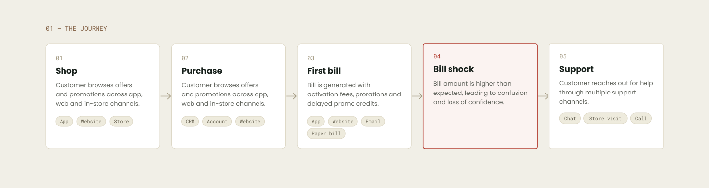
Understanding the journey
We reviewed customer feedback, listened to support calls, and mapped the billing journey to understand why customers were reaching out for help. We found that the issue wasn't a single screen or an incorrect charge—it was a confusing experience from purchase to the first bill.

research
We knew what was happening. Now we needed to understand why.
Support metrics showed what customers were calling about. To uncover the reasons behind those calls, we listened to customer support conversations and analyzed how both customers and agents experienced the billing journey.

From 80 support calls to insights from 400,000+ interactions.
Analyzed 400K+ support call summaries to identify recurring billing issues and emerging themes.
NotebookLM helped us cluster insights, validate recurring pain points, and reveal the moments that repeatedly led to customer confusion.
Findings
Three moments kept repeating across the journeys.
We reviewed customer feedback, listened to support calls, and mapped the billing journey to understand why customers were reaching out for help. We found that the issue wasn't a single screen or an incorrect charge—it was a confusing experience from purchase to the first bill.

One-time fees made the first bill feel much higher than expected.
Prorated charges were frequently mistaken for duplicate billing.
Customers didn’t recognize some services on their bill and weren’t sure when they had opted in.
team workshop
Workshop with Retail internal team
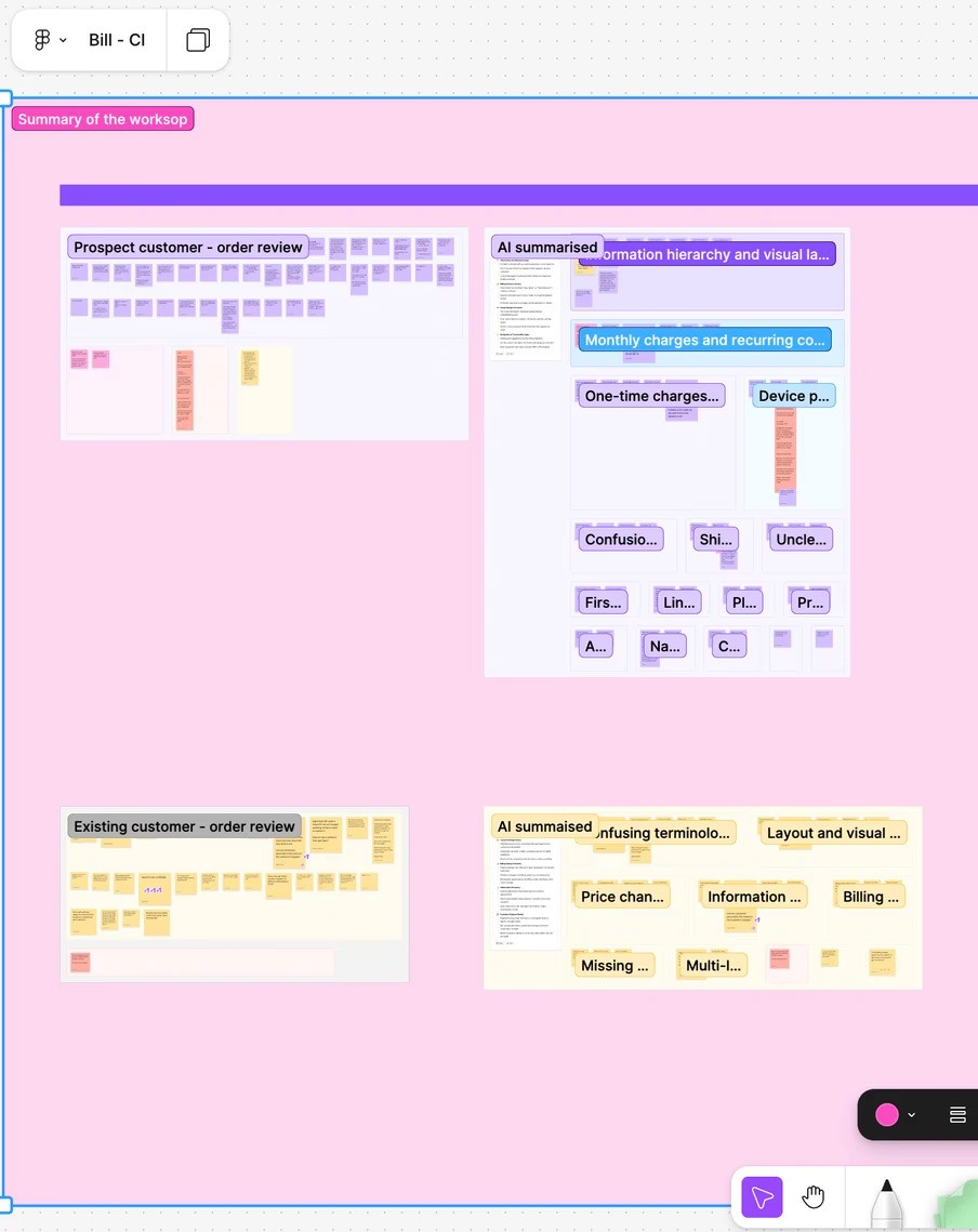
Next, we facilitated a workshop with the retail checkout team to map the in-store checkout experience. Together, we traced how activation fees, proration charges, and plan details were explained to customers.

From Insights to Patterns
We started mapping recurring pain points across the checkout journey. This helped us move beyond individual issues and uncover deeper friction around activation fees, proration, promotions, and billing transparency—especially in the cart and order review experience.
Experience gaps
Flat hierarchy
No strong visual emphasis on what matters most.
Rep don’t know where to focus to see bill impact at a glance.
No clear separation of bill costs
Complex pricing models (plans, devices, taxes, proration).
Time-sensitive checkout environment.
No clear separation of bill costs
Complex pricing models (plans, devices, taxes, proration).
Time-sensitive checkout environment.


Connecting the dots across the journey.
Our research revealed that the first bill wasn't the root cause. Confusion had already begun during checkout, where multiple small moments of uncertainty accumulated into a poor post-purchase experience.

ideation
Turning insights into solutions
With a clear understanding of the problem, we began exploring design concepts. Through multiple iterations, we tested ideas, refined interactions, and gradually shaped the experience into the final solution.

ideas from workshop
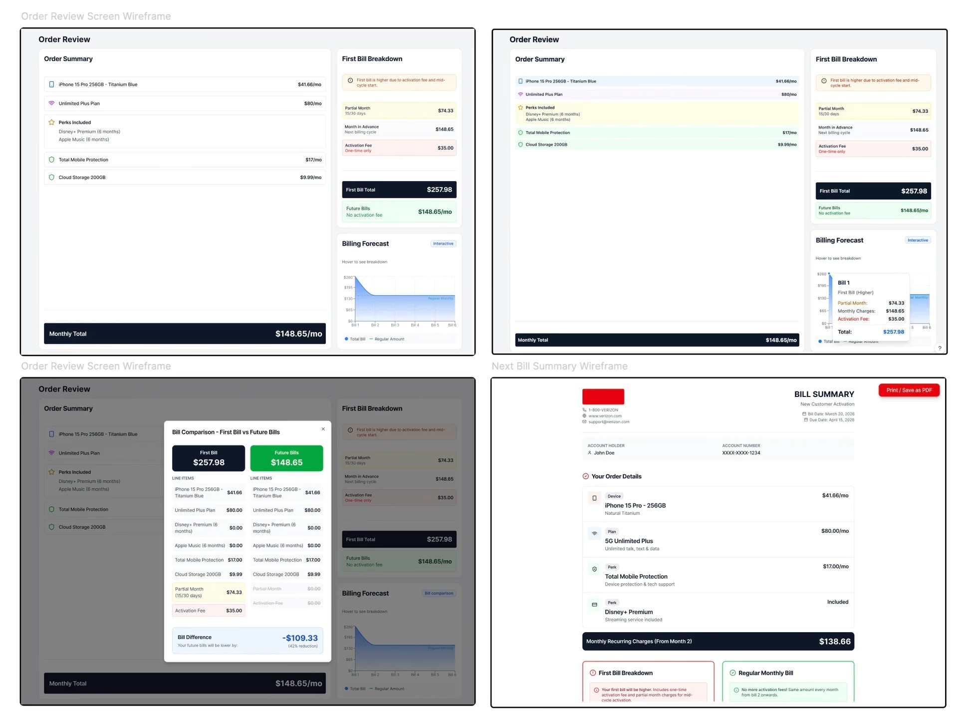
We quickly translated ideas into interactive concepts with Figma Make, helping stakeholders visualize the experience and align on the direction early.
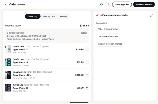
There were two concepts finalised and we did A/B testing of the two and variation B received was more favoured by users and stakeholders. The client's vision was to move towards more AI driven workspace.

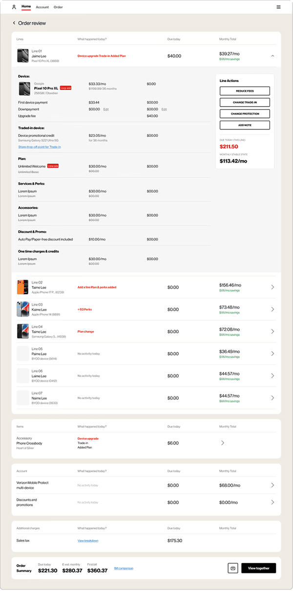
We improved pricing clarity by separating one-time charges from recurring monthly costs and giving customers an upfront estimate of their upcoming bill.
We introduced bill comparison into the checkout experience, helping customers clearly understand how their upcoming bill would change before completing their purchase.
Point of Sale , B2B
🔒 NDA
This case study has been adapted to honor confidentiality agreements. Certain details have been altered or omitted to protect proprietary information, while accurately reflecting my role and design approach as a Senior UX Designer.
Role
Senior UX Designer
Team
Product manager
CX partners, Developers
Timeline
3 Weeks
Tools
Figma, Jira
Domain
Telecom
Platform
iPad mini
The problem
Our research revealed that 22% of post-purchase support calls were triggered by confusion over the customer's first bill after an in-store purchase.
Customers left the store believing everything had been set up correctly—a new device, a new plan, and applicable promotions. But when their first bill arrived, the amount often looked different from what they expected due to one-time charges, prorated amounts, taxes, and promotional credits.
Design opportunity
This insight shifted our focus from simply reducing support calls to building confidence before the customer ever received their first bill.
We set out to create a transparent bill preview that clearly explained expected charges, promotional credits, and what customers could expect on their upcoming bill.
discovery
Understanding the journey
We reviewed customer feedback, listened to support calls, and mapped the billing journey to understand why customers were reaching out for help. We found that the issue wasn't a single screen or an incorrect charge—it was a confusing experience from purchase to the first bill.
research
We knew what was happening. Now we needed to understand why.
Support metrics showed what customers were calling about. To uncover the reasons behind those calls, we listened to customer support conversations and analyzed how both customers and agents experienced the billing journey.
From 80 support calls to insights from 400,000+ interactions.
Analyzed 400K+ support call summaries to identify recurring billing issues and emerging themes.
NotebookLM helped us cluster insights, validate recurring pain points, and reveal the moments that repeatedly led to customer confusion.
Findings
Three moments kept repeating across the journeys.
We reviewed customer feedback, listened to support calls, and mapped the billing journey to understand why customers were reaching out for help. We found that the issue wasn't a single screen or an incorrect charge—it was a confusing experience from purchase to the first bill.
Next, we facilitated a workshop with the retail checkout team to map the in-store checkout experience. Together, we traced how activation fees, proration charges, and plan details were explained to customers.
team workshop
Workshop with Retail internal team
One-time fees made the first bill feel much higher than expected.
Prorated charges were frequently mistaken for duplicate billing.
Customers didn’t recognize some services on their bill and weren’t sure when they had opted in.
We started mapping recurring pain points across the checkout journey. This helped us move beyond individual issues and uncover deeper friction around activation fees, proration, promotions, and billing transparency—especially in the cart and order review experience.
From Insights to Patterns
Experience gaps
Flat hierarchy
No strong visual emphasis on what matters most.
Rep don’t know where to focus to see bill impact at a glance.
No clear separation of bill costs
Complex pricing models (plans, devices, taxes, proration).
Time-sensitive checkout environment.
No clear separation of bill costs
Complex pricing models (plans, devices, taxes, proration).
Time-sensitive checkout environment.

Our research revealed that the first bill wasn't the root cause. Confusion had already begun during checkout, where multiple small moments of uncertainty accumulated into a poor post-purchase experience.
Connecting the dots across the journey.
With a clear understanding of the problem, we began exploring design concepts. Through multiple iterations, we tested ideas, refined interactions, and gradually shaped the experience into the final solution.
ideation
Turning insights into solutions
ideas from workshop
We quickly translated ideas into interactive concepts with Figma Make, helping stakeholders visualize the experience and align on the direction early.
There were two concepts finalised and we did A/B testing of the two and variation B received was more favoured by users and stakeholders. The client's vision was to move towards more AI driven workspace.
Variation 2
Variation 2
Variation 1
We improved pricing clarity by separating one-time charges from recurring monthly costs and giving customers an upfront estimate of their upcoming bill.
We introduced bill comparison into the checkout experience, helping customers clearly understand how their upcoming bill would change before completing their purchase.
We improved pricing clarity by separating one-time charges from recurring monthly costs and giving customers an upfront estimate of their upcoming bill.
We introduced bill comparison into the checkout experience, helping customers clearly understand how their upcoming bill would change before completing their purchase.